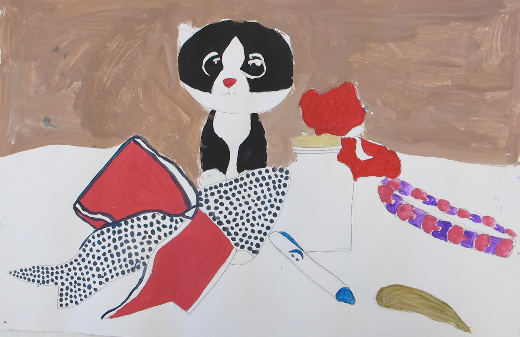
Kat
Generally fairly adept at art, this student didn’t seem to get the idea of painting value gradations to render the image toward realism. The black edging and the flat red treatment of the ribbon and other elements take this more to a poster/cartoon image. I would have liked to see what she could have done with attention to that.

