Grade 7/8 Abstraction in Cubism
Session 1:
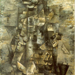
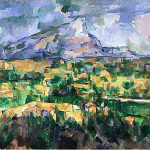
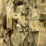
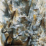
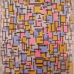
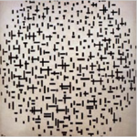
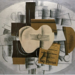
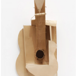
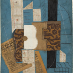
I gave the class a brief introduction to one of the most important movements in Art in the last century: Cubism! I talked about the idea of abstraction (isn’t all Art just that? Or even one’s own perception?), and then I talked about how Cubism took the different views of things (from different angles) and flattened them all to show at once with a single view. Or how shapes became geometric, even cubes … abstracting what we see. (It was a quick intro that missed alot, but this is for Elementary level, after all.) So, I showed them examples of paintings by Cezanne, Bracques, Picasso and Mondrian – and talked about what they were seeing.
While looking at these paintings, I brought to their attention (and listed on the board for them to refer to later) some elements to look for/consider:
- repetition / variation
- line quality / weight
- balance / imbalance
- focal point
- composition
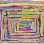
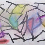
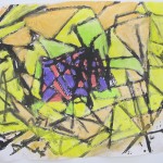
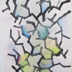
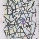
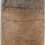
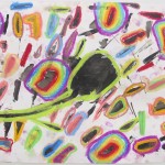
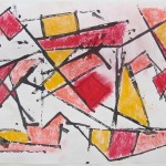
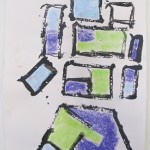
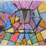
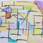
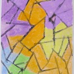
Now, to it. We were to begin with a non-representational composition. I set them up with the method and materials we were going to use that day: everyone got a few sheets of 18″x24″ paper, a tray of black paint, and a couple of small pieces of corrugated cardboard. The cardboard was their painting tool! It was important for them to use the edges of the cardboard by stamping them onto the page, not dragging them across to get a line, or like a paint brush. Limiting them to simply stamping would help with the angularity needed for this exercise in Cubism.
My suggestions along the way? Work to develop interest, use the whole page, go for variety and repeating patterns, and decide on an area to be the focal point and emphasize that.
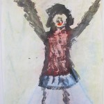
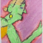
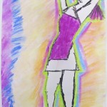
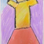
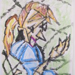
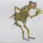
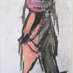
After they completed a couple of those compositions, it was time to continue with the method and draw from observation. What to draw? Me! I did a couple of poses, holding for about 3 or 5 minutes. This was harder to compose over the whole page than the first abstracts, but they had fun trying! ( In addition, I have to admit that it was harder for me to hold the pose at age 50 than it was when I was in my 20’s …)
<Remember, by clicking on an image, you will see it in its entirety.>
- Braque
- Picasso
- Picasso
- Cezanne
- Mondrian
- Mondrian
- Braque
- Braque
- Picasso
- Aila
- Victoria
- Ethan
- Hannah
- Hannah
- Leanne
- Ben S.
- Annelise
- Diego
- Alex
- Annelise
- Cierra
- Victoria
- Paige
- Julia
- Ben S.
- Aila
- James
- Ryanne
- Julia
- Ethan
- Leanne
- Hannah
- Olivia
- Paige
- Brayden
- Ben B.F.
- Annika
- Carrie
- Leah
- Ben B.F.
- Brayden
- Nicole
- Chris
Session 2:
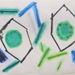
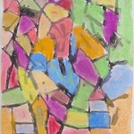
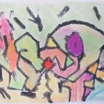
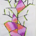
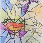
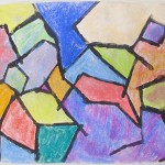
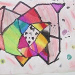
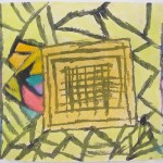
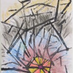
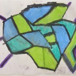
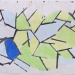
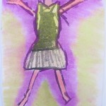
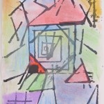
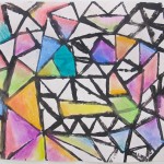
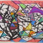
The first session was all about black paint; now it was time to put some colour to it. I reviewed the important elements of composition, again emphasizing establishing a focal point. If their drawings did not show one at this point, they would need to use colour to give the composition one. We gave them chalk pastels so they could blend and transition colours – I encouraged them to use the lines and shapes they created with the black cardboard, and to extend the colour to cover most or all of the page. This was easier with the first non-representational abstracts, as not everyone had cubist lines beyond the figure. It was theirs to make the artistic choices – I pointed to the colour wheel to illustrate such choices. Using complimentary colours, for instance, would create a drawing that would be more energetic/vibrant. Monochromatic (variations on one colour) or use of secondary colours would produce a softer, more static result.
As I walked throughout the classroom, I was impressed by how quickly the drawings began to look good – really good.
What’s next? How about Synthetic Cubism? Collage/assemblage, here we come.
Fall 2012 /Parliament Oak School


You must be logged in to post a comment.