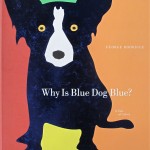
Why is Blue Dog, Uh, Blue?

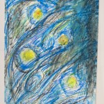
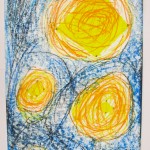
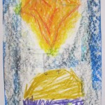
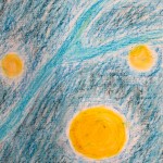
Art Project based on a BookI had to order the book from the States, but I knew I wanted to do an art project based on George Rodrigue’s  Why is Blue Dog Blue?.  Such a fun book.  His artwork illustrations just get you wantin’ to bust open some paint and get at it.  So, that’s what we did!

I showed the kids the book:  they quite liked Rodrigue’s fun illustrations!  Then, I had them complete the following sentence at the bottom of their page:  “Blue Dog is —— when he is  ———–.

Their next task was to draw and paint an illustration to suit the caption.  Fill the page, bright paint colours, and they could draw blue dog as the kind Rodrigue does, or one of their choosing.

Over the three or four classes this project took (I could tell by the chatter about the tables they worked), I’d say this one was a winner!   The results were featured for sale to their parents during the end of year Art Show and BBQ …

So we all won.


Many thanks to ‘We Heart Art’ lesson plans for steering me in the right direction.  Check it out and more at www.ourartlately.blogspot.ca

Early Spring 2012 / Parliament Oak School

Posted in Art Education, Grade 4/5 Art Projects | Tagged , | Comments Off on Why is Blue Dog, Uh, Blue?

Torn Paper Portraits

Grade 7/8: Collage Portraits

This project had the ability to go beyond the Art Room, and so it did.  After completion of the art project, the teacher assigned research and reporting on each personality.  The learning went on!

To start:  I chose famous people who have made a positive difference in our world in the last 100 years, and made 2 copies of a head shot of each.  I introduced the lesson by showing the photos to the students to see if they recognized any of them.  The recognition results?  Very few, I’m afraid, but I gave them a brief bio after introducing each one.   Here’s the list:

1.  Dalai Lama                                      6.  Nelson Mandela

2.  Mahatma Ghandi                           7.  Jane Goodall

3.  Pope John Paul II                          8.  Bono

4.  Martin Luther King Jr.                 9.  Terry Fox

5.  Albert Einstein                              10.  Mother Theresa

I would say that the art is mixed in its results.  It helps to blur your eyes as you look at them (reduces the images to darks and lights – a technique I encouraged them to use on occasion as they were working).  Using torn scraps of coloured paper I provided, I gave them the task of rendering the portrait as a mosaic.  They were to leave the pupils of the eyes untouched, and the background would be completed at the end. The modulations of darks and lights were most important to observe, colour could be unnatural (cf.  Andy Warhol’s Marilyn Monroe, Henri Matisse’s Woman With Green Stripe).

Remember, if you click on each image you will see it in its entirety.  Good luck!

The background of each portrait was left to the end.  In the process of their research, students wrote words on the computer that would describe their famous person.  Then they ripped up that page, so the words were still somewhat visible, and applied the pieces only to the unfinished background.  The plain white scraps with small black script proved to be a thoughtful and good visual contrast to the rest of the artwork.  It was an idea that the teacher (Janice Bohonos) and I came up with during the process.

I would say that this is a project that requires a class with the patience to see it through, and a level of artistic ability to ‘see’ the tonalities.  I am still working on my own attempt:   a portrait of Lech Walesa, now that my daughter Leah has joined in my efforts to finish.  I’ll post it when I am done.

Early Spring 2012 / Parliament Oak School

Thanks to the Incredible Art Department for this one!

www.incredibleart.org

Posted in Art Education, Grade 7/8 Art Projects | Tagged , | Comments Off on Torn Paper Portraits

At Last, Clay in the Classroom

Grade 7 Pottery

It is what I was trained in, and yet this will be the first time I have taught it in the classroom.  How good it was to return to clay!  I still love the wonderful cool and earthy smell of it.  Now, before I get too lost in the reverie, here is one of the things we are working on at Parliament Oak.  Coil pots, still unfired, yet to be glazed.  And the end of the school year approacheth!  Yoiks.

Still, here’s a sneak preview – more to come…

Early Spring 2012 / Parliament Oak School

Posted in Art Education, Grade 7/8 Art Projects | Tagged , | Comments Off on At Last, Clay in the Classroom

A Patchwork Landscape

Grade 3/4 One-Point Perspective Landscapes

Here is an engaging lesson in perspective that had the students enjoying the process AND the result.

I began with a standard illustration of one point perspective – a road with fenceposts and telephone poles decreasing in size toward a vanishing point.  We talked about scale of objects, and how that changes when they are near or far.  Terms such as foreground, middle ground, and background were reviewed.  It was not nearly as dry as it sounds – this was accompanied by enthusiastic back and forth movements on my part to illustrate the point!

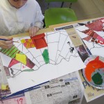
I had my own example piece to show them where we were heading.  First, crimp the page slightly at the top edge to mark the middle, make a small dot for the vanishing point.  Then, draw a slightly wavy horizon line about 3/4’s of the way up the page.  I had them draw lines out from there to mark the fields – not straight; this is a rolling landscape …

After marking it out in pencil, I had them go over the lines in black oil pastel, which would act as a resist later on.

Previous to the class, I roughly cut out various pictures out of magazines, and organized them into 3 groups: small, medium and large.  I gave each student 3 pictures, and their task was to cut them carefully in outline and then figure out where to place them:  Fore, middle, or background.

The last step is where the fun really begins:  PAINT!!  I encouraged them to be creative and try different designs and textures to make a patchwork landscape.  Had any of them ever been in a plane and seen the fields below?  Or looked at a crazy quilt?  Bright colours were just fine, not limited to earth colours at all. (It was important that the painting of the landscape happen after glueing the pictures, so the overlap of paint makes them look part of the scene, not pasted on.) Trees on the horizon, small and stylized – remember, it’s a matter of scale.

Do this one again?  You bet!

Fall 2011 / Ferndale School

I adapted this lesson (only slightly) from one I found at www.kidsartists.blogspot.ca

Thanks, Jacquelin!

Posted in Art Education, Grade 3/4 Art Projects | Tagged , , , | Comments Off on A Patchwork Landscape

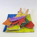
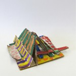
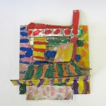
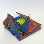
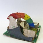
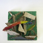
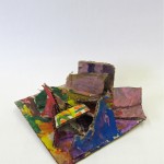
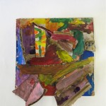
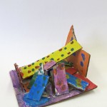
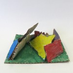
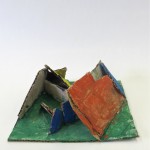
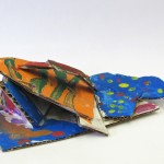
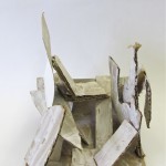
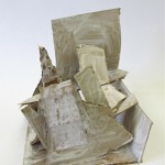
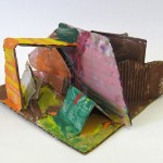
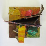
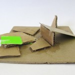
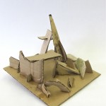
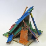
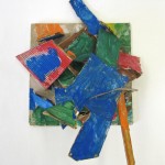
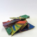
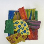
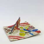
Cardboard Abstractions

Grade 2/3 Sculpture Construction

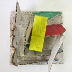
I am really likin’ this project.  Definately a ‘do-again’.

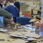
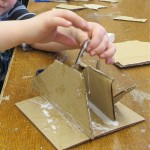
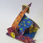
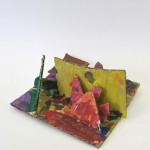
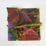
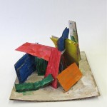
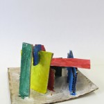
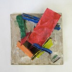
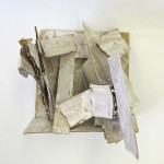
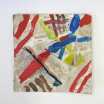
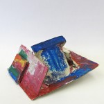
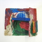
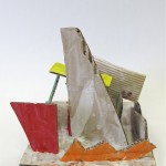
These are built as three dimensional pieces, but some of them look quite different and wonderful when photographed from above.  This flattens the image, but I have included those as additional photographs in this gallery.


I knew I had to try building one before attempting to teach this class!  Would the glue hold quickly enough so the kids wouldn’t get frustrated with pieces of cardboard falling down?  Could they build upon other pieces in a single class?

I got the idea for this project from one of my favourite blogs, There’s a Dragon in My Art Room (look for the link at the end of this).  Phyl suggested using Elmer’s Glue-All, which dries faster and is stronger BUT, uh, we do not have that in OUR Art Room.   Sooo, the kids had to practise their numbers and count to twenty while holding each piece they glued.  For the most part, it worked!   There were a few who got a little ambitious too fast, and didn’t count quite to twenty …

Class One:  I spilled small pieces of corrugated cardboard in the center of their tables, cuttings from other class projects; they could also cut their own from other cardboard scroungings on hand. I demonstrated how they could attach the pieces by putting glue on the edges, intersecting with other pieces at different angles, and using what is in place to give stability.  Once they started to see their sculptures forming, some of them really began to use their imaginations. “What it would be like to be really small and walk into the ‘hidey places’ they created and even climb through their sculptures?”  Love that!

Class Two:  I had them paint their sculptures all white, using the school paint on hand.  This I would do differently next time.  The school white just wasn’t strong enough to cover the brown of the cardboard, and the resulting colours just didn’t “pop” the way they could have.  My suggestion?  Invest in some cheap white house paint, make sure they have smocks on, and put newspaper down on the tables.  Better.

PS:  I also had them paint two diagonal lines corner to corner on the bottom of the base, to keep it from curling up.  (You can see the ones where that got missed.)  We used the hair dryers to speed the drying all over, then:  colour!

I showed them that they could paint each of the cardboard pieces a different colour/pattern; they could extend that onto the base, or they could paint the base a different colour.  I suggested that they try to keep the different cardboard planes/parts as different, and not to paint them all the same.  Colour mixing was fine, and putting flat colours with patterns really work well.  So, they had at it …

I am quite pleased with the results, and I think they were, too!  We don’t have a display case for 3D work, so I hung them on the bulletin board in the hallway, using black netting to help fasten them.  Wowsers!

Winter 2012 / Parliament Oak School

For more, check out  www.plbrown.blogspot.ca


Posted in Art Education, Grade 2/3 Art Projects | Tagged , , , | Comments Off on Cardboard Abstractions

Christmas Tree Prints

Grade 3/4 Printmaking:

There is a lovely class at Ferndale School that I so enjoy coming to teach art to …

A simple process really, and an easy way into printmaking at this age level.  I showed them a chart of different silhouettes of trees, and we noticed the differences in shapes – I posted this at the front of the classroom in case they would need to refer to it.

We began with scrap paper to quickly sketch stylized winter or Christmas trees.  Some of the students come from other faiths, so we opened up the ideas to include all.  Then I supplied the students with clean foam meat trays, with the sides cut away.  Using their pencils, they redrew their trees, with or without presents or decorations.  By going over their lines in the styrofoam with more pressure, the  lines are incised.  Ready for printing!

Using foam rollers and either green or red paint as ink, each student pulled two prints, side by side.  To finish, a ‘frame’ was created with multiple prints of ONE of their fingers.  Given the individuality of one’s fingerprints, how their eyes lit up when I suggested that there were no other artworks in the world exactly like each of theirs!

Fall 2011 / Ferndale School


Posted in Art Education, Grade 3/4 Art Projects | Tagged , , | Comments Off on Christmas Tree Prints

Drawing & Painting Still Life

The Grade 7/8’s Construct a Still Life

Bring in a favourite object, I said.  When it came to class time, very few remembered to (Aaagh – even with reminders), so it became rather a collection of hastily grabbed objects.  Too bad;  I had hoped the project would hold more personal significance, and be more interesting.  But, it is what it is – so we went with it.

I told them about a painter I observed when I worked in the Art Department at the University of Calgary.  John Hall would construct elaborate, shallow depth still lifes, photograph them, and then render them into large painted canvases using super realism.  We would replicate some of his processes when it came to the second half of the project.

Day One & Two (and Three, I guess):

The students arranged their objects into a shallowbox still life, on fabric draped over small pieces of wood.  This provided a staged setting for the composition, and they set up their drawing tables accordingly.  Instruction was given on drawing with pencil using close observation.

Starting with sketching the still life overall, they could then begin to add detail in smaller shapes, and beginning to use shading to make objects appear 3 – dimensional.

I encouraged them to draw what they see, not what they think a given object should look like.   Observe the different values here, as light hits various objects, and the shadows play a part in the composition.  Angles are different for each student there, so, combined with each person’s individual personality of drawing:  everyone’s will look slightly different!  Take a look.  (If you double click on an image, you will see it bigger in it’s entirety, and perhaps with comments from me.)


Day Four & Five (maybe even Six):

Now familiar with the composition, the students were ready for the next part.  I had photographed the still life, and the teacher copied that image onto transparancies, which we projected onto heavy stock paper so the students could trace out the shapes and basic details.  It was not so much about the drawing now, but getting to the paint!  They went onto to filling in what detail they needed freehand in pencil, and then applying the paint. In pairs, they had the photo in front of them as further reference, and the colour copy of it posted on the board.  I encouraged them to observe closely, watching the change in values as the light hit different objects, and keeping from flat applications of colour.  This was a challenge for them, along with their tendency to chat with brushes poised and still.  We could not extend the project to any more classes – it was going to start to drag for them.  And be a drag.

I would do this lesson again, but only with a class I know would be excited about building a personal still life together, commit to the long term – and one (like this one) that is relatively small.  Don’t get me wrong.  I’m glad we did it, and I think they learned from it.

(I did.)

Fall 2011 – Winter 2011 / Parliament Oak School


Posted in Grade 7/8 Art Projects | Tagged , | Comments Off on Drawing & Painting Still Life

We’ve Got Tide Pools!

Phase One Tide Pools:  Grade 1/2 Starfish

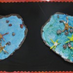
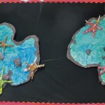
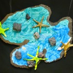
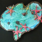
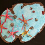
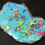
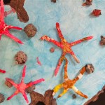
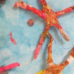
The idea started with paper mache starfish, and it IS going to go on from there.  I had the grade 1/2’s get busy with  aluminum foil and coloured tissue paper (thank you, everyone who has given our family gifts with proliferations of tissue paper erupting from said gift bags …).  Spindly, spidery starfish complete with a shake (or two or three) of glitter at the end.  Voila!

(actually, it took two or three classes to complete, so not quite the straight shot I am making it out to be)

As we were in process, I began to think about where these starfish should reside for display purposes.  This, combined with my penchant for scrounging and the happy placement of scads of styrofoam panels neatly stacked in boxes at the curb by one of Parliament Oak’s neighbours just as I arrived at school one day.  YES!

Of course, in a rare moment of confluence, the principal also happened to arrive just as I was hauling the big box of styrofoam across the road into the school.  Flushed with the excitement of my find, I called out “Isn’t this great?  These will be PERFECT for the tide pools!”  She groaned, “Oh, no – now we will be getting calls from the neighbourhood about the school garbage picking!”  She was smiling as she said it, so I just kept coming.

On my own (in the peace and quiet of the Art Room), I put together the styrofoam panels with cardboard backing, and glued on the tide pool paintings.  Right!

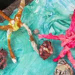
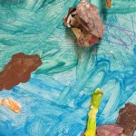
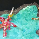
After the starfish were completed (with wires for attaching) I had the students get into 4 groups, and paint the bluegreen water of  their groups’ pool (complete with tools for texturing).  They loved working big with paint … next class the same groups arranged the newspaper rocks (already made and painted previously) and their starfish in their tide pools.  If I may say so myself, they looked GREAT!

So, here’s the thing – there is more to come.  The Tuesday Art Club has already made hermit crabs using real shells and magic clay, but they are a bit too small and delicate to include, I think.  We got some strands of  crimped paper kelp up there, though.  Thursday Art Club is currently working on some sea anenomes using wire and fabric.

We shall see what else may appear in our school tide pools … there are often surprises in such things if you just look long enough.

In the meantime, consider this like Google Earth: we’ll zoom in slowly on these starfish in their habitats.  (mostly because I like looking at every shot)

I hope you enjoy the journey.  More to come!

Winter 2012 / Parliament Oak School

Thanks to http://useyourcolouredpencils.blogspot.ca  for the idea and instruction on the starfish, by the way.

Posted in Grade 1/2 Art Projects | Tagged , | Comments Off on We’ve Got Tide Pools!

Everybody Digs Jasper Johns (and Bill Evans)

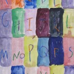
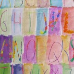
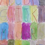
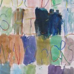
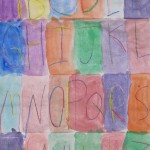
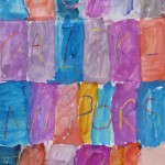
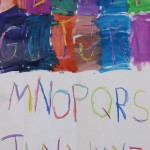
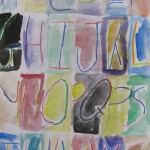
Grade 2/3 Colour Wash Alphabets
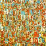
Jasper Johns “Numbers” (1958/9)

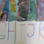
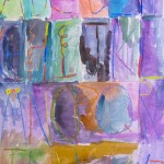
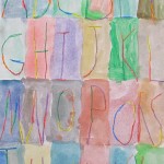
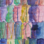
I have to say that these are some of my favourite results in teaching art so far.  That may be oversimplifying it, but I just never get tired of these ones!  You may notice that one even provides the unchanging backdrop for this website …

It proved a bit of a challenge to communicate the method to the students (mostly because I got confused), but perhaps that is because it was going through the sieve of MY brain, after all.

So, let’s take a look, and I’ll try to describe how we organized it.  By the way – the kids?  Loved it.

The idea for this one came from one of the many art blogs I visit:  http://ourartlately.blogspot.ca/

Or, commonly known as “we heart art”.  Some of my Parliament Oak students will find THAT phrase sounds familiar …

Using 12×18 white, I prefolded all the paper into 24 symmetrical boxes, which doesn’t completely cover the whole alphabet, but don’t worry.  Just hang on to that thought for a minute.

Day One:   In class, I showed them some examples of Jasper Johns  paintings that utilize alphabets and numbers – we were going to have some fun with colour that day!  I had them use only capital letters for their alphabets, using the folded rectangles to write each individual letter (lightly) in pencil.  From the front, I wrote out the rows of letters they were going to do.

ABCD

EFGHI

JKLM

NOPQR

STUV

WXYZ

Now here’s where I got a bit confused (because I THOUGHT I had it all worked out):  On the lines with FIVE letters, they were to draw the letters from the middle out to either side.  The middle letter has to go exactly in the centre on the fold, fanning out from there.  That way, all of the letters fit without crowding on one side.  Woot!  Symmetry is good here.

They thought that was pretty cool how we made all the letters fit in.  I do, too.

I gave them crayons (no brown or black though) to go over their pencil lines, and encouraged them to have fun with the colours, even using several on some letters.  They had to press fairly hard with the crayons, so it would show through the paint.  Loving it so far!

Day 2:   Then it was time to get out the paint (and on with the smocks) – mixed to a watercolour consistency, and painting each rectangle individually. Yep:  paint right over the letter, and see what happens!  They thought that was pretty cool, too.

As I have mentioned before, the results were just stunning.  They graced the walls outside the classroom for quite some time because – ahem – nobody wanted to take them down!

Give it a couple of years, and I will do this one AGAIN.

Fall 2010 / Parliament Oak School

So, who is Bill Evans?  He was an American jazz pianist whose work I really enjoy.  I played his 1958 album “Everybody Digs Bill Evans” on CD while the class was working.  Both the music and the painting hail from the same year … so perhaps Johns was even listening to some Evans while he was painting … ?
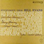
Everybody Digs Bill Evans (1958)
 

Posted in Art Education, Grade 2/3 Art Projects | Tagged , | Comments Off on Everybody Digs Jasper Johns (and Bill Evans)

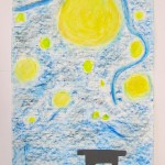
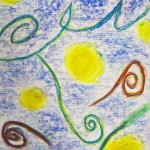
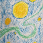
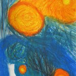
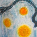
Starry Night / Advent Banners

Vincent Van Gogh / Starry Night

Grade 6 / Starry Night over Bethlehem

I  was asked to do something for Advent with the grade 6 class at St. Michael Catholic School.  So I started with a reading from the Gospels, describing the star that marked the place where Jesus was born, and of the shepherds and wise men who were directed to seek out this singular baby, the Son of God.

We talked about the star being so much bigger and brighter than the rest, perhaps. Emmanuel.  God with us.  What must it have been like to wait for such a thing?  To see such a thing?

Then we went on to talk about Van Gogh, and the emotion he brought to his work.  One can see it in the very brushstrokes!  I showed them a large print of ‘Starry Night’ – just happened to be in their school library.  Yes.  Love that.

Could we bring some of the elements of Advent and Van Gogh’s work together, to make banners?  Sure we can!

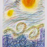
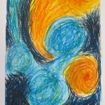
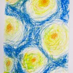
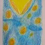
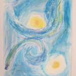
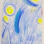
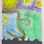
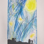
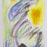
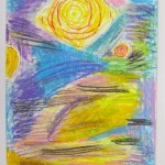
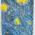
First the sky.  I gave them each sheet of  9″x20″ paper, the heaviest I could scrounge, and with a bit of tooth.  Then, oil pastels, with directions to almost completely fill the page with the night sky in the style of Van Gogh.  Remembering (of course) to emphasize one star, which would make this truly an Advent picture.  I encouraged them to be bold with the colours (press that colour right into the page!) and with the marks they make – to let that all show, and to use many colours to enrich the night sky.  This suited some more than others, but they had the poster before them to refer to.

I gave them a choice of venue for the remainder. The landscape was to be in silhouette at the very bottom of the page, cutting out black construction paper to be glued on.  They could show the shepherds in their fields at night, the stable in Bethlehem, or the wise men approaching on their camels.  If I were to do this lesson again, I would give them more help with this part (since Exacto knives are not part of the classroom kit, except for my own closely guarded one); perhaps some possible templates, or time to draw out the scene in pencil on white paper before tracing it and cutting out the black.  It is very difficult to come up with an interesting skyline without some practice.

The following class I brought in pieces of wood to fit across the top – we stapled and glued the banners on, and tied a length of yarn for the hanger.  Done!  Well in time for Christmas, and to decorate their homes for the season of Advent/anticipation.  They were quite pleased with the results, I think – and glad to have something they could take home.  Leah’s is still hanging on our main bathroom door some 4 months later!

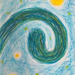
Okay, I’ll make it easier on you with that Spiral Jetty reference.  Robert Smithson was a landworks/earth artist. This was his most well-known work.  At least I had to know it for certain Art History exams.  His work didn’t come up during this art lesson at all – the kids’ work just took me there.  Check out more visuals at:

www.robertsmithson.com

Fall 2011 / St. Michael School

Posted in Art Education, Grade 5/6 Art Projects | Tagged , , | Comments Off on Starry Night / Advent Banners