Remembrance Day Paintings

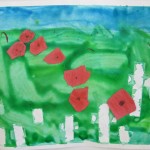
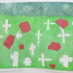
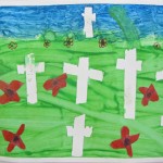
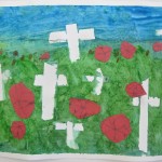
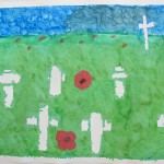
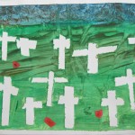
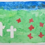
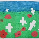
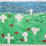
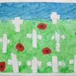
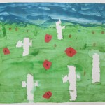
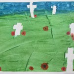
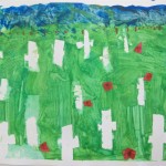
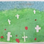
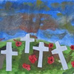
Grade 2/3 Poppy Fields

Marlow / 2009

This is the second time I have done this lesson over the years, but the first time predated this website.  Just days before the school assembly honouring those who fought to keep our freedom, we did this lesson in one double period.

I began by reviewing some basic ideas in landscape:  establishing a horizon line, and the different scale of objects near and far away:  depth of field (no pun intended).  Foreground, middleground, and background.  I always love this part because I demonstrate by standing alarming close to one student (that always  gets their attention when I use my big voice as well) and then moving back, and back again (slamming into the white board or even out into the hall works well).

I was so pleased to see that they were familiar with the poem ‘Flanders Fields’; several students chimed in to recite it to me.  We talked about grave markers in our town’s cemetery, and then the ones found in those fields in France.  Today, we would be using only the white crosses as markers.

Each student had one piece of heavy paper (bristol board, as we could not afford watercolour for this) taped to the table in front of them.  Drawing lightly with pencil, I had them position the horizon line at least 3/4’s of the way up the page.  They were going to need most of the painting to be the field so they could have room for lots of crosses, and to try their hand at establishing  depth of field using scale.

Each student had scissors, and so we gave them each a length of green painter’s tape, already cut in half lengthwise.  They cut the pieces for their crosses (long one for the vertical part, short piece for the other), putting the bigger crosses at the bottom (foreground) of their page, and the small ones at the top at the horizon line (background), with the middle-sized ones in the middleground.  It was important to emphasize the placement of the different sizes. I pointed again to my drawn example on the board, so they understood how to establish a sense of distance (depth of field).  Another important detail:  they really need to press the tape firmly onto the page so that the edges of the cross keep the paint out.

Now it was time to crack out the paint (and smocks, of course).  I gave each pair of students two double trays (President’s Choice Butter Chicken/Pad Thai/Chicken Korma containers work great for these, plus I can catch a break in making dinner once in a while) … one of green and a bit of yellow or white, and then one of blue and a bit of purple or orange.  I encouraged them to not just use the paint straight from the bottle , but to mix as they painted on the page.  Yes, they could paint right over those tape crosses!

We have a basket of items that are good for texture (sponges, fruit netting, small squares of bubble wrap, forks, etc.) – which I almost forgot – with these they could give their wet paint some texture if they liked.  The bubble wrap was a particular favourite!

As their paintings dried, with the aid of a roaming hairdryer or two in the hands of the teacher and I – it was time for the poppies.

Using red construction paper from the scrap box, and red pencil crayons to colour them even more (same idea as not just using the paint from the bottle), they were to draw different sizes of poppies and cut them out.   Lots of poppies.  I reminded and showed them that those poppies at the horizon lines would be little more than dots (in fact, they could use the pencil crayons at the end to add some to the background if they liked) AND that poppies would NOT be bigger than the crosses around them.  Quite a bit smaller, in fact!

A single dot of black with Sharpie marker completed the poppies, so now it was time for the magic reveal!  Carefully lifting the green painter’s tape crosses off their pages, they could see the  contrast of the white crosses against their green fields and blustery skies.  Woot!

(just a note here:  the painter’s tape did allow some paint to bleed in a little, so regular making tape might be better if you have good quality heavy paper – watercolour – but you run the risk of it tearing the paper as you try to lift them off.  It’s a trade-off)

Poppies were then pasted on, artistry signed, and I put each painting in a black construction paper frame to complete.  Very moving, in conjunction with the assembly.

In Flanders fields the poppies blow

Between the crosses, row on row,

That marks our place; and in the sky

The larks, still bravely singing, fly

Scarce heard amid the guns below.


We are the Dead.  Short days ago

We lived, felt dawn, saw sunset glow,

Loved and were lovoed, and now we lie

In Flanders fields.


Take up our quarrel with the foe:

To you from failing hands we throw

The torch; be yours to hold it high.

If ye break with us who die

We shall not sleep, though poppies grow

In Flanders fields.

(John McCrae, May 1915)


Many thanks to Gail at that artist woman blog for this project.  Definitely a winner!    http://www.thatartistwoman.org

Another note:  this is one project where I think it is good NOT to have a completed example for them to see.  They are familiar with the image of the poppy field from their classwork, and the surprise they experience when lifting the masking tape is worth them having to trust me with the process.  There is more variety to be had sometimes when there is not a finished object that says “Do it THIS way”.



Posted in Art Education, Grade 2/3 Art Projects | Tagged , , | Comments Off on Remembrance Day Paintings

Snapshots from Out West

On a recent trip out west, amidst Young Life meetings and time with family, well, we saw a few things.
Posted in Art Along the Way | Comments Off on Snapshots from Out West

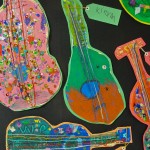
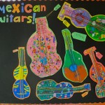
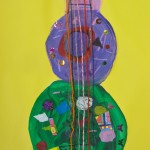
Ola! Mexican Guitars!

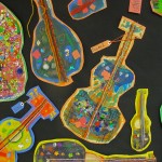
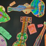
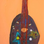
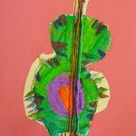
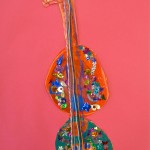
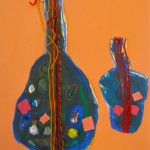
Grade 2/3:  Drawing and Painting Guitars

(2 double period classes)

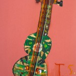
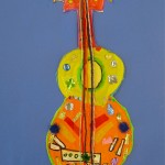
To start, I brought in a couple of visuals.  Some pictures of brightly coloured Mexican guitars, along with the equally colourful musicians who play them AND my friend Brian’s custom acoustic guitar.  Now, his guitar wasn’t as big and colourful as a true Mexican guitar – but setting it up at the front of the class gave the students a basic form and the details to draw that day.  Plus, some of them got pretty excited to tell me that they have a guitar at home, and I learned that a couple of them are even learning to play guitar.  Very cool.
Oh, did I say I had some guitar music playing in the background?  I did, later. (after I finished talking, that is)  Oscar Lopez, in fact – who I first heard play at the Calgary Folk Festival.  Awesome.

But I digress.

Now, To Really Start:

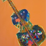
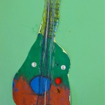
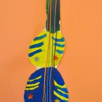
I gave them big sheets of manilla paper and encouraged them to fill their page with a quick pencil drawing of the guitar, and all of it’s details.  Draw what they see, not just what they think a guitar might look like.  I kept this part of the project quick, so they did not become discouraged or bored, or start overdrawing what the paint would eventually cover anyway.  That kept the shapes fresh and they didn’t have to worry about proportions, or drawing a ‘perfect’ guitar.

Next, we broke out the paint and got some fun colours happening!  I told them there would be another material I would make available later, but PSST – it was a secret.

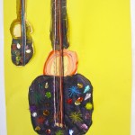
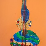
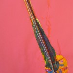
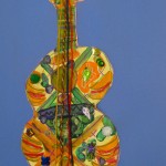
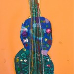
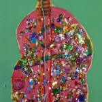
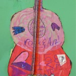
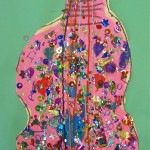
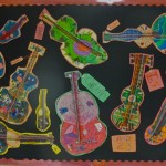
They could choose what colours of paint they wanted to use, but it had to be more than one.  There were a couple of girls who were really bent on pink (as you can see), so you guess what colours I gave them.  They were not to paint the guitar strings in black, because we were going to use yarn glued on for that at the end. (still not the secret ingredient yet)

After the paint dried, the strings glued on (I would recommend a small tray with slightly watered-down glue in it, and dipping the pieces of yarn – cut longer than what will be needed  – before applying it to the paper), and the dust settled – it was time.

Time for sequins, a few sparkly pompoms, AND even a few large 3D gems.  Wow.  They were in seventh heaven!  We had plenty of the sequins, so I didn’t limit those, and as you can see – the two pink guitar girls did not hold back. Ha ha.  Then they cut out their guitars:  almost done.

The last part was for them to glue their guitars onto a coloured background.  I had them choose the colour that was opposite the main colour of their guitar, looking at the colour wheel – or close to it. Complementary colours, in fact.

We are enjoying all of the results on the bulletin board outside the Art Room, even now.

I’m not completely happy with the guitars mounted on the paper as is – I may try to recut with the background as a border and then glue onto cardboard.  Maybe.  It’s not like I don’t have anything ELSE to do.

Doing this made the guitars show much better … they really pop!  Not only that, but when it comes time to send them home, they are more rigid/durable, and will hang quite well there.

Fall 2012 / Parliament Oak

The source for this lesson?

Painted Paper:  Fun Art Projects for Kids

www.paintedpaperintheartroom.blogspot.ca

Posted in Art Education, Grade 2/3 Art Projects | Tagged , | Comments Off on Ola! Mexican Guitars!

Fall Leaves on an Autumn Day

Grade 2/3:  Tissue Paper Leaves        

This was a great first lesson, with me as the ‘guest artist’ coming into this class, one fine October day.  How nice to meet this lovely group of kids, and to look forward to doing more Art with them over the year!

Walks in the woods, jumping in piles of leaves, watching leaves fall and the patterns on the ground.  We talked about that, and then I gave them each a printed sheet with line drawings of different leaves, a blank sheet of white paper, a Sharpie marker, and oil pastels.  Trace a few and colour them, and then continue with the squares of coloured tissue paper.  These too were traced with the marker using the leaves template, and glued over the others.  I encouraged them to overlay the leaves, as they would land on the ground.  Colours mix and the lines of leaves intersect.  Nice!

Big thanks to Patty at Deep Space Sparkle for this idea AND the how-to …

DSS

October 2012 / Ferndale School

Posted in Art Education, Grade 2/3 Art Projects | Tagged , , | Comments Off on Fall Leaves on an Autumn Day

Exploring Cubism

Grade 7/8  Abstraction in Cubism

Session 1:

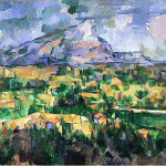
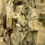
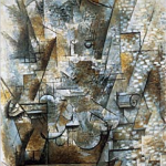
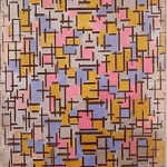
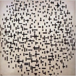
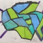
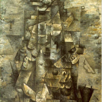
I gave the class a brief introduction to one of the most important movements in Art in the last century:  Cubism!  I talked about the idea of abstraction (isn’t all Art just that?  Or even one’s own perception?), and then I talked about how Cubism took the different views of things (from different angles) and flattened them all to show at once with a single view.  Or how shapes became geometric, even cubes … abstracting what we see. (It was a quick intro that missed alot, but this is for Elementary level, after all.)  So, I showed them examples of paintings by Cezanne, Bracques, Picasso and Mondrian – and talked about what they were seeing.


Man With a Guitar, 1911

Braque

Mont Sainte-Victoire, 1902-04

Cezanne


Portait of Wilhelm Uhde, 1910

Picasso

Still Life With Violin, 1911

Braque


Mondrian

Composition in Line

Mondrian


While looking at these paintings, I brought to their attention (and listed on the board for them to refer to later) some elements to look for/consider:

  • repetition / variation
  • line quality / weight
  • balance / imbalance
  • focal point
  • composition

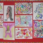
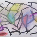
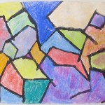
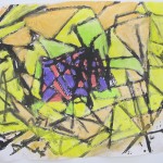
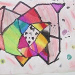
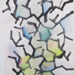
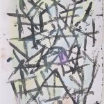
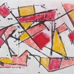
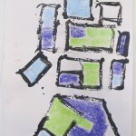
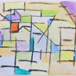
Now, to it.  We were to begin with a non-representational composition.  I set them up with the method and materials we were going to use that day:  everyone got a few sheets of 18″x24″ paper, a tray of black paint, and a couple of small pieces of corrugated cardboard.  The cardboard was their painting tool!  It was important for them to use the edges of the cardboard by stamping them onto the page, not dragging them across to get a line, or like a paint brush.  Limiting them to simply stamping would help with the angularity needed for this exercise in Cubism.

My suggestions along the way?  Work to develop interest, use the whole page, go for variety and repeating patterns, and decide on an area to be the focal point and emphasize that.

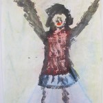
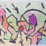
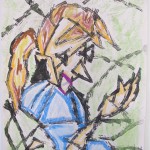
After they completed a couple of those compositions, it was time to continue with the method and draw from observation.  What to draw?  Me!  I did a couple of poses, holding for about 3 or 5 minutes.  This was harder to compose over the whole page than the first abstracts, but they had fun trying! ( In addition, I have to admit that it was harder for me to hold the pose at age 50 than it was when I was in my 20’s …)

<Remember, by clicking on an image, you will see it in its entirety.>

Session 2:

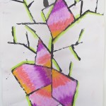
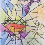
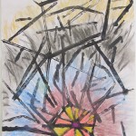
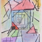
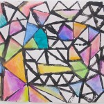
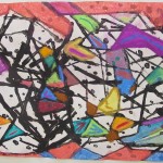
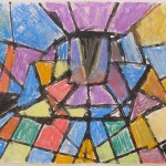
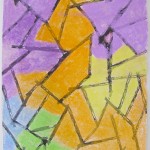
The first session was all about black paint; now it was time to put some colour to it.  I reviewed the important elements of composition, again emphasizing  establishing a focal point.  If their drawings did not show one at this point, they would need to use colour to give the composition one.  We gave them chalk pastels so they could blend  and transition colours – I encouraged them to use the lines and shapes they created with the black cardboard, and to extend the colour to cover most or all of the page.  This was easier with the first non-representational abstracts, as not everyone had cubist lines beyond the figure. It was theirs to make the artistic choices – I pointed to the colour wheel to illustrate such choices.  Using complimentary colours, for instance, would create a drawing that would be more energetic/vibrant.  Monochromatic (variations on one colour) or use of secondary colours would produce a softer, more static result.

As I walked throughout the classroom, I was impressed by how quickly the drawings began to look good – really good.

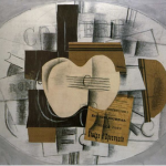
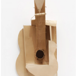
What’s next?  How about Synthetic Cubism? Collage/assemblage, here we come.

Picasso

Guitar and Program, 1913

Braque


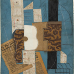
Guitar, 1914

Picasso


Fall 2012 /Parliament Oak School

Posted in Art Education, Grade 7/8 Art Projects | Tagged , , | Comments Off on Exploring Cubism

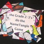
The NameTangle Game

Grade 2/3:  Doodling Around With Their Names

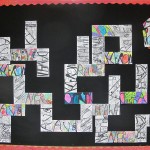
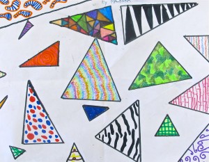
This was great as a first Art Project for the year.  Some students were new to me, but many had done Art with me the year before.  We talked about different kinds of lines; thick and thin, how doodles, letters and even shapes can form lines.  I had an example up on the board of different doodles and line possibilities for them to refer to later.

We began in pencil, drawing the letters of their name at different angles and spanning them from top to bottom as much as possible.  When that was done, they were each given a regular black Sharpie marker to go over those lines to make them quite thick.  The next step was to divide the negative spaces between the letters with pencil lines, extending to the outer edges of the rectangle.

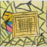
Now it was time for fine Sharpies.  Go over the dividing lines and then draw different doodles and lines within each section.  I encouraged them to vary the designs and the concentration of lines between the sections to provide interest.  It was really great to see their imaginations at work here, and the results soon began to look quite stunning.

We made copies of these Black & Whites, and subsequent classes with just the teacher saw them applying pencil crayon and/or coloured markers.  Wow!  Some of them really pop!

I like them both ways:  with the colour and just B&W.  What do you think?

Thanks to the Bees Knees Cousin blogspot for this idea.  I love the results … thinking there are several ways one could take this 3D with other students.  What about covering miscellaneous objects with white house paint, sanding for smoothness, and then covering with this kind of graphic?  Hmmm.

I displayed them on the bulletin board as a domino-type game … there may be some possibilities there, too!


www.thebeeskneescousin.blogspot.ca

Fall 2012 / Parliament Oak School


Posted in Art Education, Grade 2/3 Art Projects | Tagged , , | Comments Off on The NameTangle Game

Another Year, and the Art Keeps Comin’

We are swinging into another year in the Art Room and beyond.  Woot!

Explorations in Cubism, close observations of guitars and music genre, drawing and painting are all underway.  We’ve had our first Art Challenge, another to come, and the 2 Art Clubs are starting.

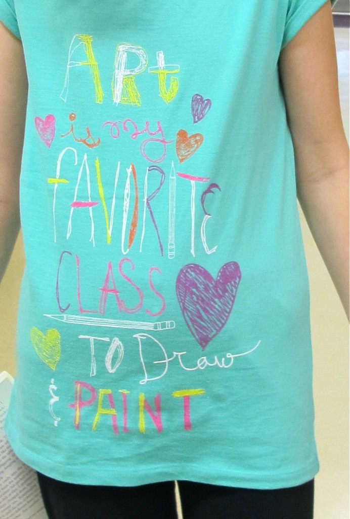
I saw one of my students wearing a great t-shirt one day, and I think it the perfect image to start the year off with.  Thanks, Jessie!

Posted in Art Education | Comments Off on Another Year, and the Art Keeps Comin’

The P.O. Art Challenges of 2011-12


Every few weeks of the year, I have run an Art Challenge with the students of Parliament Oak Elementary School.  It is completely voluntary, and is not connected with their schoolwork.  The entries are judged by myself and an impartial (and often different) person.  Prizes are awarded, and some of the Challenges have sparked some great ideas and enthusiasm! (for the project AND for the prizes)  Here is a recap of the Challenges we did:

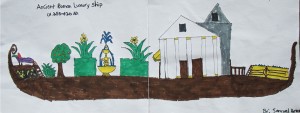
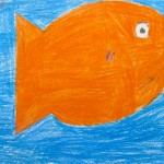
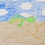
Art Challenge #1:  Draw a picture of a form of transportation you would use to get to school.

Winner:  Samuel


Art Challenge #2:  Winter Twinchies!

Winners:  Kaylee and Aila

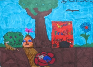
Art Challenge #3:  No Such Thing

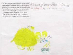
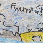
There is a great author and illustrator that my teacher librarian mom introduced me to:  Bill Peet.  I used his book ‘No Such Thing” for this Challenge.  I made written copies of the descriptions of the creatures, but did not make the illustrations available.  What would a blue-snouted Thwump look like?  Or how about the pie-faced Pazeeks?

Winner:  Julia


and another entry:


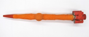
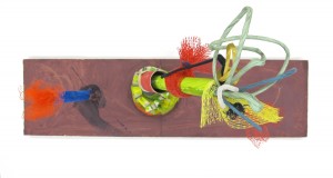
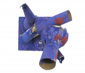
Art Challenge #4:  Make Something Using 4 Toilet Paper Rolls

(and whatever else you can find)

Winner: Jay


2nd Place:  Ava


3rd Place: Maggie


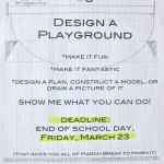
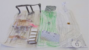
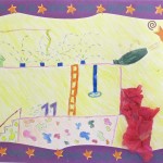
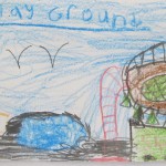
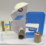
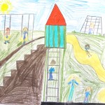
Art Challenge #5:  Design a Playground


Winner:  Paige

Other Entries:


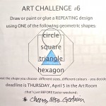
Art Challenge #6:  Make a Repeating Pattern Using One Geometric Shape


Winner:  Machara


other entries:


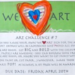
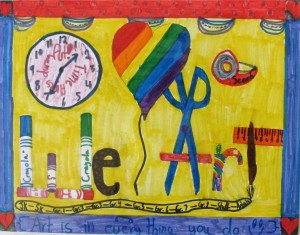
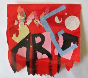
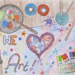
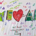
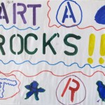
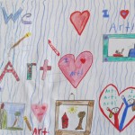
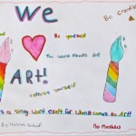
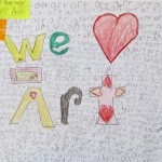
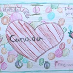
 Art Challenge # 7:  Make Your Own “We Heart Art” Sign for the Art Room


Winner:  Aila


2nd Prize:  Beth


3rd Prize:  Isabel  

Honourable Mentions:  Emilie, and Nick & Hunter


Other Entries:

As you can see this was a very popular Challenge.  Thanks to everyone who participated.  The Art Room looks just great!

Art Challenge #8:  Draw & Write a Postcard to Someone Out of Town

I provided the blank cards, with instructions to get their parents to help address the cards.  I would provide the stamps, and mail them (which I did, from Victoria).  The art goes out.

Winner:  Samuel

Other Entries:

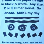
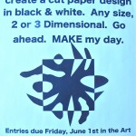
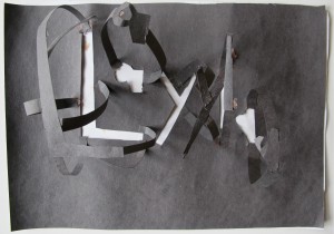
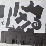
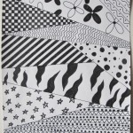
Art Challenge # 9:  Create a Cut Paper Design in Black & White

Winner:  Layla

Cut Paper Composition

Other Entries:

Cut Paper Design

Black and White Patterns

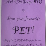
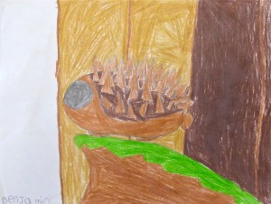
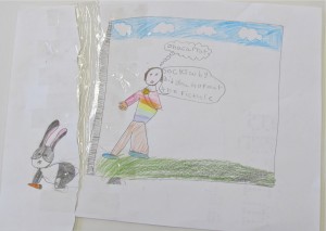
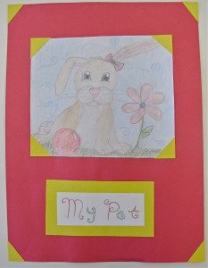
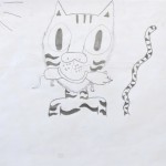
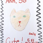
Art Challenge #10:  Draw Your Pet

Whoah!  This one really caught their attention – I received a deluge of entries.  So, we awarded three levels of prizes, and everybody who entered got a giant bubble wand to begin their summer with!

Primary Winner:  Benjamin

Junior Winner:  Flo

Intermediate Winner:  Emilie

Other Entries:

That’s it.  See you next year for another whole whack of fun – I mean, Art Challenges!

Posted in Art Challenge, Art Education | Tagged | Comments Off on The P.O. Art Challenges of 2011-12

More Op Art Cubes

Grade 7/8:  Op Art Cube Sculptures

There was a distinct ‘Op Art Buzz’ going on, so I took the ideas and lesson I did for Op Art cubes with the grade 6’s at the other school, and added a pedestal to display the grade 7/8’s efforts.  We taped a half-opened paper clip to the inside of one corner so that the opened end stuck out.  This spike could then be inserted into the small drilled hole in the top of the dowel making up the display stand.  The students had already painted them black with a gloss paint, and they set off the cubes quite well.

(I will say, however, that it would be important to attach the paper clip securely BEFORE the the paper sides of the box are glued together to make it 3D)

The sculptures were a popular item in the Art Room for a while, and I know at least one made it home as a Christmas present!

Fall 2012 / Parliament Oak School


Posted in Art Education, Grade 7/8 Art Projects | Tagged , , , | Comments Off on More Op Art Cubes

Op Art Cubes

Grade 5:  Exploring Op Art and Cubing It


Op Art Explored

This fall saw several of the classes learning abut Op Art (Op is for Optical), and some of the artists who developed it.  Victor Vasarely and Bridget Riley (1950’s) were two that the students became familiar with.

Then, drawing from resources at www.incredibleart.org, I showed the students how to do some basic    Op Art designs, a different one on each square making up the cube they would put together.  The grade 5’s at St. Michael School really got excited  about this project – in the months since I hear how they have continued to make Op art designs in different places – one student even used his new-found skill to make a Christmas card for his grandparents!

The bright colours come from using permanent Sharpie markers (one of my favourite tools), and we glued the folds of the square together with a loop of monofilament attached on the inside with a paper clip.  (nts:  Make sure that paper clip with the filament tied on is well-secured with tape before it is folded into a cube)

It was a real accomplishment to finish these, and the students were very proud of them. (understandably!)  Watch for the results from the grade 4/5 class at Parliament Oak, soon to be posted.  They make the parts for a quilt!  (Just gotta get out my sewing machine)  In the meantime, here are 2 places you might want to check out for more Op Art fun:

www.op-art.co.uk  (take a look at the gallery, and then have some fun with the music board)

or the Opartica Tunnel.app for some Wowsers!

Art Education Projects for Elementary Kids


Fall 2011 / St. Michael School

Posted in Art Education, Grade 5/6 Art Projects | Tagged , | Comments Off on Op Art Cubes