Tooled Foil Reliefs

Grade 7/8:  A Musical Interpretation Set in Aluminum Foil

Session 1:

It began with brushes and pots of black washes of paint, LOTS of big sheets of paper, and music.  I should say I mentioned some things like Dadaism, automatic writing, direct response, and then I gave them a demo.

Standing, not sitting, with loaded brush in hand, the music from an old cassette came on.  The idea?  To paint lines ALL over the page, not thinking, not ‘making pictures’ – just a direct response to the music filling the room.  The tempo, the mood, the pace, the repetition, the progression, my own emotion:  all would inform the marks put to page.  Music change, page change.

Then it was their turn.

Session 2:

Each student had about 10 paintings to choose from, and so I had them select their favourite to take to the next level.  After demonstrating the next step, I gave each student a bottle of white glue to squeeze lines of ridges to follow the patterns of the paint.  They could make continuous and broken lines, dashes and dots.  After the glue dried, the idea was to have a raised surface that reflected the marks on the page.  However, school glue did not retain structure, so we found instead we had to use various sizes of string to give us that.  So, dipping the string in glue (cut slightly with water) did the trick!

Session 3:

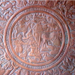
Now that the cardboard drawings were well set with the pattern of raised lines, we painted the entire surface with white glue, and laid down a single sheet of aluminum foil over top.  Pressing the foil into the depression of the surface, it was important to work all the details.  The final step was to go over the foil with black paint.  After drying it slightly, then they wiped and rubbed over the surface with paper towel to remove the paint on the raised details.  Suddenly, they looked beautiful …

The result is similar to tooled and beaten metal reliefs from various cultures and throughout history.  For our part, we kinda liked ’em.

Early Spring 2012 / Parliament Oak School

Posted in Art Education, Grade 7/8 Art Projects | Tagged , , | Comments Off on Tooled Foil Reliefs

Enter, Notan.

Grade 5:  Flipping the Positive and Negative With Notan

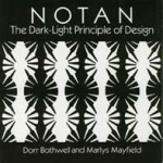
I recently purchased this book, Notan: The Dark-Light Principle of Design
and even though I have so far only taken a rather cursory look at it – I found the images compelling and the basic principles interesting.  Notan is a Japanese design concept that involves the play of light and dark, as they are placed next to each other.  Balance, reversal, positive and negative space, symmetry and asymmetry, flat shapes cut out or rendered in ink or paint.

Perhaps you would like to try doing one …


Thanks to the Incredible Art Department for this lesson:  www.princetonol.com

There is a good video on YouTube that is worth watching or showing to students (I found it after the fact):  a Notan Design Instruction Video, posted by loreli981 in 2007.  Check it out!

Spring 2012 / Parliament Oak School

Posted in Art Education, Grade 4/5 Art Projects, Grade 5/6 Art Projects | Tagged , | Comments Off on Enter, Notan.

More Zendalas, Please

Grade 5:  Exploring Pattern with Zendalas

This was a quick lesson to fill in with the grade 5’s as the 4’s were working on their Medieval castles.  There was less instruction on my part than the last time I taught these, but the students were fine to ‘doodle away’ to the sounds of some light classical and jazz (and their own conversation). Once again, we laminated the results.  Here they are:

Spring 2012 / Parliament Oak School

Posted in Art Education, Grade 4/5 Art Projects | Tagged , , , | Comments Off on More Zendalas, Please

Dabbling in Surrealism

Grade 5:  Learning Surrealism, Constructing Pictures

Session 1

I came to the class with an example of a picture I had created using magazine cutouts in the style drawing from an art and cultural movement known as Surrealism, that began in the 1920’s.  I introduced them to the basic principles and expressions of the movement; that of dream imagery, startling elements put together, and tapping into the unconscious.  Then it was to the computer lab, where they could look at various images of Surrealism, featuring the works of Rene Magritte and Salvador Dali.  They loved it!  So cool.

Now it was time to get back to the Art Room, and the big stack of magazines piled in the middle of the table.  Their first task was to find a picture that would constitute the background, and fill the assigned piece of boxboard given for glueing on. (Actually,  I wasn’t proactive on this part until I realized that just getting them to cut out different pictures would result in more of a collage than a picture).  Once the background was in place, I encouraged them to assemble a collection of images, roughly cut, to place in an envelope until the next session.

Session 2

Carrying on to completion, the students continued to collect images, but it was also time to begin choosing those they want to use to create their picture – putting strange elements together to build a story – or just surprise us!

They had some fun with this; even the teacher got involved and made her own.  It was interesting to watch those who were quite willing to ‘get weird’ with their pictures, how that spurred others on, and yet how for some that weirdness was more difficult.  The fun continued when it came time to label their creations.  A title and an artist name:  we decided to add a famous artist’s name to each student’s own.  They helped make the choices.  Great stuff!

The verdict from my son on this one:  “it was one of the best projects we did all year, Mom” – even though he didn’t think he did the best with his that he could have.  Maybe he will get another chance …

Spring 2012 / Parliament Oak School


Posted in Art Education, Grade 4/5 Art Projects, Grade 5/6 Art Projects | Tagged , , | Comments Off on Dabbling in Surrealism

Pattern & Communication: Wampum Belts

Grade 6:  Designing Their Own Wampum Belts

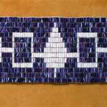
Iroquois Wampum Belt


The teacher asked me to do an art project that would connect with the class’s work on Canadian indigenous cultures.  It had to be a relatively simple and quick lesson, as the end of the school year was quickly approaching and school work was piling up.

Wampum belts were made by the Iroquois, and highly prized.  They were used to sanction council meetings, confirm treaties,  communicate events, or signify tribal outlooks and records.  Wampum beads were made from the whelk Purple and the quahog clam shell.  Different symbols and colours were signifiers, and repetitions and variations of pattern often suggest timelines.

We looked at some different examples of wampum belts from history, and discussed the importance of symbols to communicate.  Each student was given a long narrow piece of graph paper and a small sample square of the same.  The latter allowed them to experiment with different shapes as they began to think about their own wampum belt.   What symbols could communicate something about themselves, their family, or local history/events?  The squares of the graph paper would replicate the shape of the beads of a real wampum.

Pencil crayons were made available, and I encouraged them to use them neatly, pressing down to get good colour.  For some, this was not their personality – but I still think the more successful ones employed good, solid colour.  The finished lengths of paper were laminated for durability and brightness of colour, with an idea to add strings at the ends to suggest the warp of a woven piece.  This was never realized, as the year came to a close and there was no time for any more.

In review, this could be a project that resulted in an actual weaving, with a smaller class and more time.  I might just try it.

Spring 2012 / St. Michael School

PS.  Walking in our town some months later, my daughter noticed some flags overhead.  “Look, Mommy.  Those are the symbols from the wampum belts we looked at!”  YESSSS.

Posted in Art Education, Grade 5/6 Art Projects | Tagged , | 2 Comments

Tunnels of Weightlessness?

Grade 6:  One Point Perspective meets Op Art meets Surrealism – Whaa?

This was a project that served to introduce some images and ideas that were new to the class, and to combine those with knowledge from projects already completed … kind of a nice thing to do nearing the end of the school year, I thought.

Session 1

We started with some images of Surrealism (Magritte, Dali), and a discussion of it’s basic principles and forms.  I think the images were fairly new to the class, but they were quick to pick up on some of the ‘tricks’ and the overall weirdness of the paintings’ details.  Fun!

Next, we reviewed the basics of 1-point perspective, something they had already done some simple exercises in.  Throw in a quick reference to the Op Art work we did at the beginning of the year, and we were ready to get to it.

This project took 3 double sessions, with a bit of catch-up work here and there with their teacher.  My biggest surprise came at the beginning, after we handed out the heavy stock paper (watercolour paper was not an option) and rulers and pencils.   I had them measure off the long side of the paper so as to mark a line the same length as the short side of the paper, thereby making a square on their sheet.  The remainder could be an area where they tried out paint colours as they mixed.

This basic directive was met with some confusion, and my own ability to communicate was further called into question when I attempted the next step.  Yikes!  Next was to find the center of that square and mark it with a small dot.  I showed them how to find that intersection by measuring both diagonals from the corners.  Wait!  It gets even more complicated:  I had them measure out and draw a sucession of squares radiating out from the center one, and then intersecting those with lines out from the center vanishing point.  Are you with me still?  They weren’t.  After a few whacks at it between the efforts of both the teacher and I, the lights began to go on, and we saw the mathematics of it all begin to bear fruit.  Phew!  We concluded that there are some things that we as adults take for granted in knowing how to do, and it takes a real shift of mind/perspective to get back to that ‘before’ state.  So, the set-up was more laborious than I thought, but we at least had a plan for the second session.

There was one other thing I did during this session, however.  The teacher and I chose three students (my daughter being one – there’s gotta be some perks to having your mom come in and volunteer teach Art).  I took them out into the hall and asked the to pose as if they were falling through space.  Whaa?   I’m glad we chose Leah because she was quick to get into this, despite her tendency to shyness.  I photographed them upright and on the floor to achieve this, and asked for three poses from each of them.  It was kinda fun!  They had had the experience of me photographing them with umbrellas early in the year, so this wasn’t too much of a stretch.  I swore them to secrecy, so the results would not be seen until later.

Sessions 2 & 3

Armed with all the small brushes I could find, and a limited palette of paint, the next step was to paint as watercolours a checkerboard of their squares, leaving the center one blank.  Hairdryers sped the drying, so now it was time to do some cutting.  This was a large class in whose hands exacto knives could be a problem, so the teacher and I did the cutting:  removing the centre square and cutting three sides of the of the painted squares, chosen by the student.  These would make the three hinged trap doors to build in some Surrealism.

In the meantime, the class sifted through the huge pile of magazines I carted in, to find odd images to paste in behind the cut centre square/window/end of tunnel, and the three doors.  For some, getting them to choose images that completely covered those cutouts was a challenge – it was important that it looked as though one were looking through the openings at something beyond, even just a glimpse.

One more thing, though.   Remember the pictures I took of their 3  classmates?  At this point, I pulled out the surprise element:  photocopies of them ‘falling, tumbling’ in three sizes.  Each student was to choose three.  One of each size, using at least two different images, please.  More Surrealism, don’t ‘cha think?  Using the principles of 1 point perspective, they were to place the figures somewhere in the tunnel as though the images were floating in space.  Here, they could break the picture frame and extend beyond the edges of the tunnel.  This was a particularly fun part of the project, and stepped up the interest and personal investment a lot!  I think the three students whose images we used were secretly pleased as well.

The results didn’t photograph as well as I hoped, and I am not sure if the choice of painting the squares was best.  I was wanting to give them an opportunity to work finely with paint.  I think next year I will reintroduce painting in a watercolour method, and let them go for it with washes, etc.

I do have an Art Blog to thank for this project idea, but I can’t remember which one… aargh.   When I find it I will give proper credit, I promise.

St. Michael School / Spring 2012

Posted in Art Education, Grade 5/6 Art Projects | Tagged , , | Comments Off on Tunnels of Weightlessness?

Juanita, Hot and Cool

Grade 3/4:  Draw a Chicken; Bring On the Pastels!

Session 1

Once again it was time to bring in our prettiest chicken, Juanita, to another classroom of delighted students (“We have a chicken in our class!”).  This is always a show stopper in itself, and I never get tired of the squeals of disbelief and surprise (I’m smiling as I write this).

Once the initial shock wears off, with Juanita in her cage at the center of the classroom and the desks arranged in a circle around her, I pass out big sheets of paper (one to each) and we are ready.

My instructions were this:  do a line drawing of Juanita and make her large, fill the page because Juanita herself is larger than life!  Not to draw just any chicken, mind you – rather, to draw the chicken they see in front of them AND to draw her as they see her.  That means the particular angle they have given their position in the circle, Juanita’s tendency to move (funny thing about live chickens), and by closely observing the details of her feathers, her feet, her comb and wattles.  (Yes, they learned a few new words that day.)  As you will observe by the tendency of most students to draw her with a full-on side view, you can see that they struggled to go with anything else.  I even had to prevent a few students from moving to get that view for themselves.  My instructions were for no shading, and once they were finished with the pencil lines they could go back over them with – you guessed it – Sharpie marker.

Session 2

With Juanita safely home among her sisters, and the classroom desks back in their usual rows, it was time to get some colour on the scene.  We divided the class, with one half being the COOL group (so indicated by having them snap their fingers repeatedly in true beatnik/cool cats fashion) – and the other half being the HOT group.  They thought they were being left out until I showed them their signal: the always fun ‘lick of the forefinger and touch to the butt with the accompanying sound of hot sizzle’.  Got it?  Then we just had fun having them volleying those signals back and forth a few times …

Okay.  Enough of the high jinx.  With oil pastels in hand, they were to colour just Juanita, using only the colors that applied to their group, NOT Juanita’s true pigmentations.  This took a bit of convincing, and a lesson on the whiteboard about which colours would be warm/HOT and which would be cold/COOL.  We listed them there so they could refer back as they made choices.  I have to say that at this point, as they saw the freedom of NOT having to use the nut brown colours that Juanita is, they got quite excited over their projects!

Since this session was a double one, once they had finished colouring only the chicken – it was time for the ol’ switch-a-roo.  Those who were HOT became COOL, and those who were COOL became HOT.  Oil pastels were exchanged for chalk pastels, and the task now was to fill in the background.  I gave them free rein on how they were going to to that – they could construct a scene for Juanita, or simply have her in an abstract or decorative background, as long as they used the color group that was opposite to the one they coloured their chicken with.  Again, some struggles with understanding that difference but, hey, here are the results!

I wish I could hang a few of these in our chicken coop (with the appropriate gold frames of course) – I wonder what Juanita would think?

Spring 2012 / Ferndale School

Posted in Art Education, Grade 3/4 Art Projects | Tagged , , , | Comments Off on Juanita, Hot and Cool

At Last, Totem Poles!

Grade 5/6 Paper Mache Totem Poles

I looked up in the Vancouver Airport, and what did I see?


This project would be a long process at the best of times, and this year it became even more protracted between the student teacher’s work with the class, my own trips to Jamaica and BC, plus other intervening class activities.  Phew.  We persevered, however, and finally finished in the last days of the school year.  Woohoo!

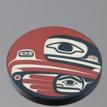
Connecting with their studies in indigenous cultures in Canada,  we looked at the ideas, history and imagery of the totem poles of the Haida on the West Coast. We talked about the significance of the animals as totems:  what characteristics and associations might they hold?

The Assignment:  come up with 3 animals that might be of significance to, or connect with, you and/or your family.  We spent some time in the computer lab to help gather ideas and images.  I had them draw out their totem animals and design the arrangement on paper at this point.

Back to the Art Room:  it was time to begin building the armatures!  Each student was given a sturdy cardboard tube, and access to other materials such as corrugated cardboard, cones, newspaper, egg cartons, etc.  Oh, and masking tape – LOTS of masking tape.

I continuously encouraged them to build their structures strong, and with extensions that exaggerated the features and pulled the totem away from just a cylinder with a few small apologetic bumps.  There was to be nothing sorry about these totems!  The bases needed to be widened to accommodate the weight that was going to occur as paper mache would be applied.  Details and features could be suggested by the forms big and small, and then detailed later in paint.

This is a big mixed class; the energy and the chatting and the mess filled the room each time.  Love it!  Collapse on the couch at home afterwards (me).

Yes, mess.  Because now it was time for the paper mache.  Students ripped countless strips of newspaper, and I mixed bucket after bucket of paper mache solution, using a flour, salt and water recipe.  My kitchen flour bucket (I do have a big one, what with running a B&B) took significant hits several times as I had to rush off to class after class, with (ahem) no time to get to the store …

Once in class …

It was interesting to watch just who dove into working with wet goop  on their hands (smocks were a non-negotiable), and who really had an aversion to “gettin’ messy” – the latter trying vainly to manage with only their two fingertips of each hand to make contact.  Hey, most just got in there and did the messy stuff anyway.  All over animated conversations of this and that, of course.  Nothin’ like workin’ together on these big projects!

Once the mache dried over the next several pungent weeks in the Art Room, the students applied cheap white house paint to their totems in preparation for the final painting.

Here was their opportunity to really kick the totems up a notch.  I had them use a limited palette of white (already there), black, brown, and red (such as what would have been available to the Haida).  This would continue to relate their totems to that tradition.   Some students forgot that the white was also an element, and began to completely cover it with brown (before I noticed in that big busy class), but for those who kept the white or reapplied it, I think the results were more successful.  I had some pictures of Haida designs at the front board for them to refer to, and I made suggestions from time to time to work in more detail and designs, to add interest and to give further clues about the animals on their totem.

This project was a long labour on their part:  kudos to Mrs. Andrews’ class for sticking with it, and producing some wonderful results!  I am really proud of you – and the totem poles look great!!

By the way:  they were featured, and offered for sale, at the Art Show – they were well received, I can tell you.  Done.

Winter – Spring 2012 / Parliament Oak School

Posted in Grade 5/6 Art Projects | Tagged , , | Comments Off on At Last, Totem Poles!

Trees of Life

Grade 2/3:  Their Own Tree of Life

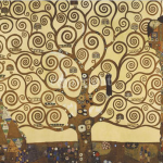
Gustav Klimt “The Tree of Life” (1909)


This was a quick project near the end of the year that I put to the grade 2/3’s.  I intended for them to have one more class period to complete them, but other events didn’t allow for that to happen.  Too bad – I was going to have them get even more ornate and decorative with their trees. (translation: fun with glueing sequins and other colourful/shiny bits)  Even a few birds roosting in the branches would have been quite appropriate!

So, one double period class.  I showed them a picture of Klimt’s painting of the same name, and then I went to some basic instructions.

Start with the trunk at the bottom of the page in the middle and notice how it starts thick, and becomes thinner as more branches form.  And how to make curlicues! (Sheesh.  The things we adults take for granted.)  For some, this took practical instruction on my part, and some practice on theirs…

They started in crayon, and then we broke out the sequins and coloured bits of paper and glue.  Not bad!  Here are the results:

Spring 2012 / Parliament Oak School


Posted in Art Education, Grade 2/3 Art Projects | Tagged , , | Comments Off on Trees of Life

Class Letters

Grade 5 Paper Mache Letters with Action! Painting

This was a project that took quite a while to complete, but the process was a good one, and had some fun moments along the way …

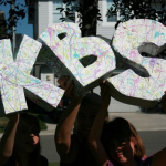
We began with building the letters, the first of each student’s name, using cut and pieced corrugated cardboard and toilet roll supports within.  Once secured with masking tape it was time for paper mache.  Here’s where you learn who has an aversion to wet messy stuff getting on their hands:  my son, for example!

We carried on (with some cajoling of said student) with three layers over the entire surface, and allowing for the inevitable textures and ‘imperfections’ to remain.  The cardboard construction took two double periods for most, and the subsequent paper mache, probably about three more double periods.  Actually, most of the students rather enjoyed this process … but now for the crazy bit!

We used household primer to seal them and give them a good clean white base.  The furniture in the Art Room was shoved back and pots of paint and brushes hauled out.  Everyone had their old clothes and smocks on, bare feet if necessary – and then it was time to fling paint, Jackson Pollock style!

(I think the kids were shocked and pleased that they got to do this inside a classroom – it was almost worth the clean-up for that reason alone!  Next time, though, I think we would do this part out on the lawn outside.)

Whatever.  The energy in the room was great that day, as the kids flicked and spattered and swiped the paint on, covering all of the surfaces.  They moved around, painting from different angles and dipping into pots of paint:  hence,  “Action!Painting”

Now that the letters were done, we could have some fun with them!  One afternoon, it was out on the front lawn to make as many words as we could with the letters available.  It was a little like Boggle on a bigger scale:  64 words we came up with, and we only stopped because we ran out of time.  Woo hoo!

What next?  Sentences, maybe …

A big game is near.                                    A bear begs a mime.

A sea breaks as I make jam.                    I wear a brim as big as a rib.


I’ve got a challenge for you now.  What sentences can YOU come up with using these letters from our class?  Send me your ideas in the comments section for this post – open to those willing participants from the class, by the way …

Winter – Spring 2012 / Parliament Oak School

My sister and her kids did some too!


Posted in Grade 4/5 Art Projects | Tagged , , , | 1 Comment